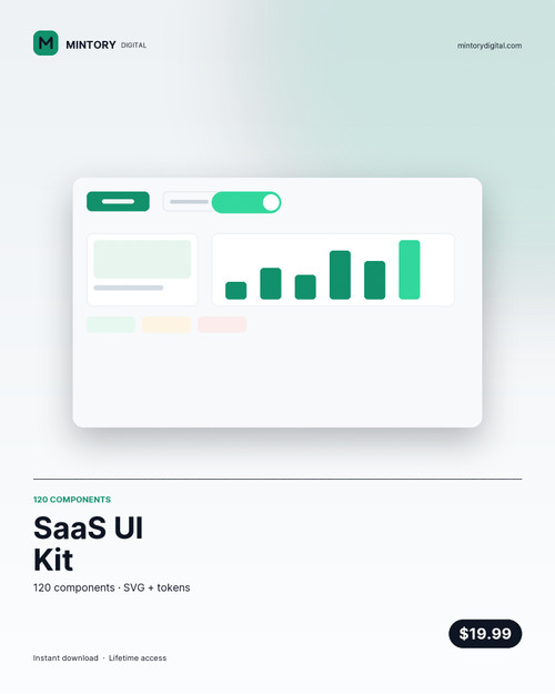
Thirty component types, four states each, one token file. Every button, input, table, modal and empty state a SaaS product needs before it ships, drawn at the same 8 px rhythm so the screens you assemble look designed rather than assembled.
What you get
- 120 components in a single SVG sheet, grouped by type — buttons, inputs, selects, checkboxes, radios, toggles, sliders, steppers, tabs, breadcrumbs, pagination, tables, cards, modals, drawers, toasts, tooltips, avatars, badges, charts, empty states and more
- Four variants per type: default, hover/focus, filled, error — the states that get skipped
- tokens.json — colour, radius, spacing, type scale and shadow, ready for Tailwind, Style Dictionary or Figma variables
- components.csv — every component with its type, variant and pixel dimensions
- Mintory-SaaS-UI-Kit.html — a browsable sheet, open it in a browser and copy what you need
How it works
- Unzip. Open the HTML sheet to see everything at once.
- Figma: drag the SVG in, then use Detach instance and rebuild as components — or draw straight from the sheet.
- Web: take tokens.json into your CSS variables, then match the shapes.
- 8 px spacing, 14 px radius, 1.5 px borders. Break those three and the set stops looking like a set.
Built at real density
The table components are drawn at 32 px row height with a 44 px header, not the 60 px showcase row height that looks good in a dribbble shot and falls apart with data. Same with the inputs — 44 px tall, 16 px padding, label above, helper text below, error state defined.
Files: SVG, HTML sheet, tokens.json, components.csv. Licence: commercial, unlimited products. Do not resell the kit itself.